
6 Tips for Engaging Donors with Your Giving Page
If you want to boost revenue for your nonprofit, you need a well-designed giving page. Your nonprofit’s website may already offer the option to donate online. But, when users navigate to your donation page, are they met with an engaging, user-friendly experience that encourages them to give more?
An effective donation page can help attract donors to your organization, bring in more revenue, and expand your nonprofit’s reach. Plus, donors will feel more connected to your mission, helping you retain supporters for the long term. With this added support, your nonprofit can establish a reliable revenue stream and use these funds to better meet your mission.
If your giving page isn’t in the best shape or you don’t have one set up yet, don’t worry! It’s easy to develop a beautifully designed donation page when you have a clear roadmap. We’ve gathered the best practices to engage donors with an effective giving page, so you can amp up your fundraising strategy. Consider incorporating these strategies to boost support:
- Use accessibility features
- Brand your donation page
- Add visuals that inspire
- Optimize for mobile devices
- Highlight specific donation impacts
- Limit the number of prompts
Your nonprofit needs a strong fundraising strategy to operate efficiently. A well-designed donation page can help you get there. Let’s begin.
Use accessibility features
For your donation page to reach as many people as possible, you need to make it accessible. According to Donately, online fundraising efforts improve significantly with a user-friendly giving page design. By incorporating accessibility features, any user can fill out your page without obstacles.
To give donors the most user-friendly experience possible, include the following design features:
- High contrast between the text and background. Your prompts should stand out boldly from your background color. If you choose a faint text color or an overpowering background color, your donors won’t be able to read the prompts or comfortably fill out the page. To improve your user’s experience, consider using bold text on a white (or lightly shaded) background so readers can digest the information easily.
- An ample amount of white space. Your donation page should look clean and organized, so avoid putting the prompts too close together. Reasonably space each element apart from each other to improve the readability of your page.
- Appropriately-sized text. If your text is too small or too large, your page will be difficult to fill out and donors will likely click away. Stick to a font size that is easy to read and doesn’t distract from the user experience.
A great donation page should be compliant with the Web Content Accessibility Guidelines. These guidelines were created by the World Wide Web Consortium to make the Internet accessible by all. Follow their checklist so you can make your page even more user-friendly (and bring in more donations!).
Brand your donation page
Customize your donate page so it’s consistent with the rest of your website and other marketing materials. This lets people know that the donation page belongs to your organization and helps build brand visibility. Plus, your donors will feel more connected to your nonprofit (and will likely donate again!).
To brand your donation page so its unique to your nonprofit, consider the following best practices:
- Use a consistent font and color scheme. Use the same font(s) and color scheme across your website and donation page so people can easily associate these features with your brand. Remember: the simpler, the better! Avoid using fonts that are difficult to read (or too many fonts) and stick to just a few colors that work well together. Try to select colors that speak to your organization’s values (for instance, green for an environmental nonprofit).
- Prominently display your logo. Your logo is a great way to represent your organization. So, why not put it on your donation page to add a sense of professionalism? If you don’t have a logo yet, design one that is creative, engaging to look at, and helps people connect with your nonprofit. You don’t have to make it too complicated! A minimalistic design can be very effective.
- Use the same messaging and tone. The voice you establish across your marketing materials is very important, as well as how you speak about your nonprofit’s mission. Make sure to adopt consistent messaging and tone across your donation page so donors aren’t thrown off by anything out of the ordinary.
Be sure your overall theme is also consistent with the rest of your website and feels true to your brand. Remember, you want donors to feel confident that they’re giving to your organization. If your donation page seems too different from the rest of your online presence, they’ll question if it’s safe to donate and whether they’re in the right place.
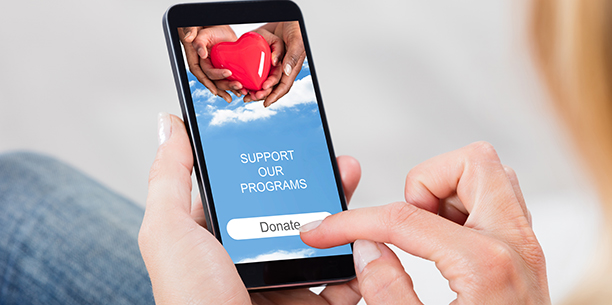
Add visuals that inspire
People’s eyes naturally gravitate towards visuals, so it’s in your best interest to add them to your donation page. Visuals break up text and can help people better connect with your messaging. They can also create emotional responses, so your donors will feel more compelled to donate and you can convert site visitors into avid supporters.
Your pictures or videos should build donors’ confidence that they are donating to the right cause. You can do this by including pictures of someone your nonprofit has benefitted with a brief description of their story.
For example, if you’re a health-focused nonprofit, consider adding a photo of a patient that was positively impacted by your nonprofit’s efforts. This builds credibility for your nonprofit and highlights the great work you’re able to do because of donors’ generosity.
If you’re creating a donation page for a specific fundraising event, it can be helpful to include pictures from this event in the past. Show your volunteers at work or attendees that are excited to be there. This lets donors see the value in your event and how their funds will be used.
Optimize for mobile devices
A mobile-friendly donation page can go a long way in expanding your nonprofit’s reach. In fact, Double the Donation reports that mobile-friendly donation pages yield 34% more donations. People are spending more time than ever on their phones, so why not make donating another activity they can do from the palm of their hand?
A mobile-responsive donation form is an important online donation tool for optimizing your page for any device size. This means that your prompts should be legible and easy to fill out from a mobile screen. If your user has to do too much scrolling or pinching to use your page, then it’s not ideal for mobile users and they’ll donate elsewhere.
If you don’t have any web design experience and you’re not sure where to start, don’t worry! You can use a nonprofit website builder that automatically optimizes your donation page for mobile devices. This way, you don’t have to do any coding or work on the technical side of your page’s design.
Highlight specific donation impacts
Donors want to feel confident that their funds are going to a worthy cause. Did you know that there’s an easy way to boost their confidence in your nonprofit and encourage them to give more?
Include a section on your donation page that lists out specific donation amounts and how they’ll be used. For example, if you’re a hunger relief organization, you could highlight how many meals can be provided with $10, $25, $50, and so on.
With each increment, demonstrate the added benefits of giving more. This can encourage donors to give more than they originally intended in order to support your nonprofit’s mission (therefore boosting your fundraising efforts!).
You can suggest these amounts in the form, but be sure to also offer a box where users can type in their amount. This gives donors the flexibility to give less (or more!) than the suggested amounts.
Limit the number of prompts
Streamline the donation process by only asking for the most essential information. This way, your donors can quickly fill out your page. If it takes too long to fill out your page or donors have to do some research or thinking to answer your prompts, they’ll be less likely to donate again in the future.
While you don’t want too many prompts, there are a few that you’ll definitely need to ask of your users. Make sure you have prompts that ask for their:
- Name
- Contact information (phone number/email)
- Donation amount
- Billing information
You can also add a prompt that lets donors sign up for monthly donations. With monthly giving, a specific donation amount is automatically transferred from donors’ bank accounts to your nonprofit each month. This is convenient for frequent donors since they won’t have to fill out your donation page each time to give. Plus, your nonprofit will have a reliable revenue stream to fund programs, services, and any other miscellaneous operations.
Whether you’re looking to improve your donation page design or build a beautiful page from scratch, these tips can help you streamline the donation experience and encourage people to give.
As you brainstorm design ideas, remember to keep your audience in mind. Your donation page should cater to their experience and help them feel more connected to your nonprofit. A beautifully-designed giving page is a great way to improve your fundraising strategy so your organization can better meet its goals. Good luck!